
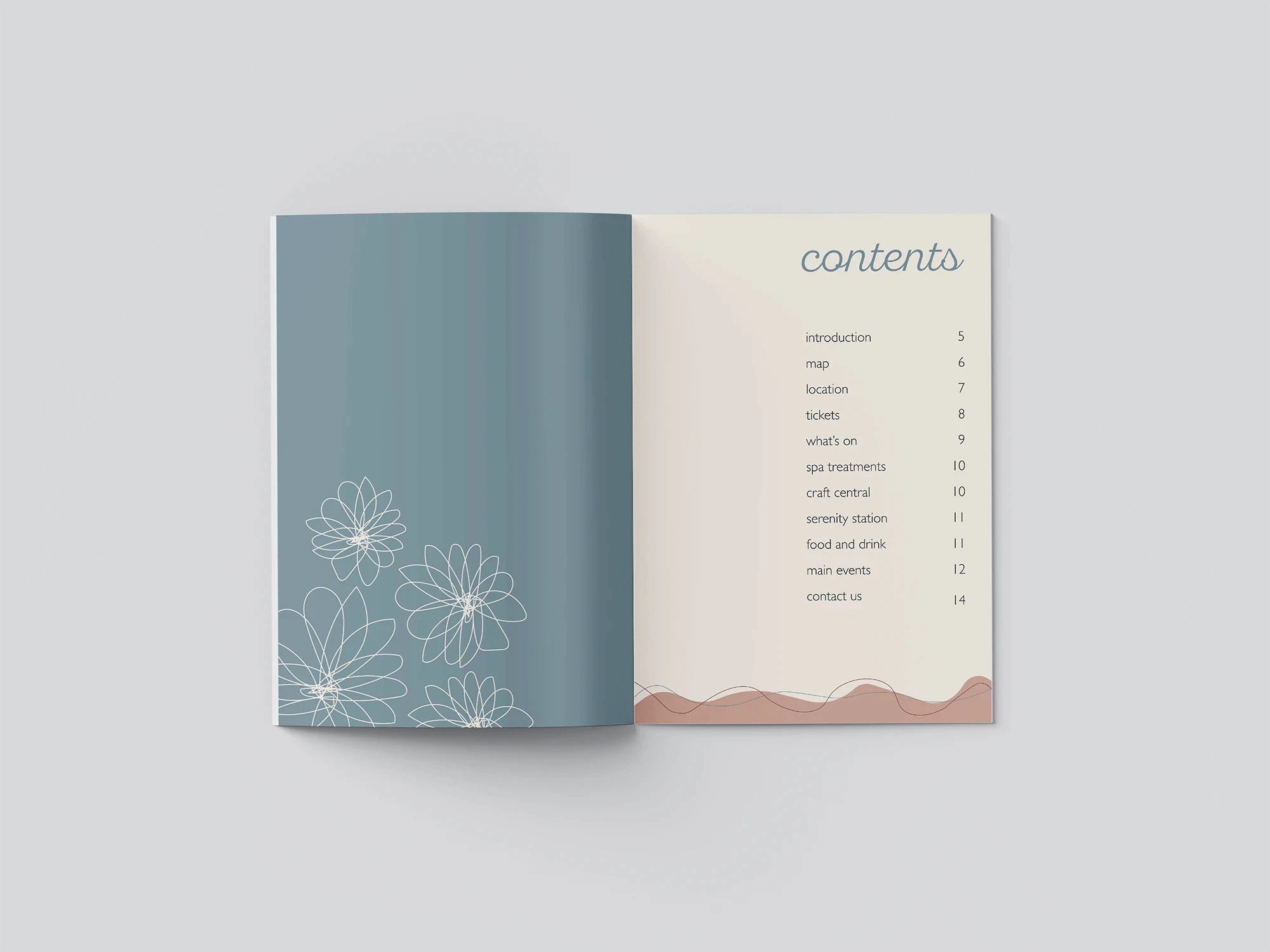
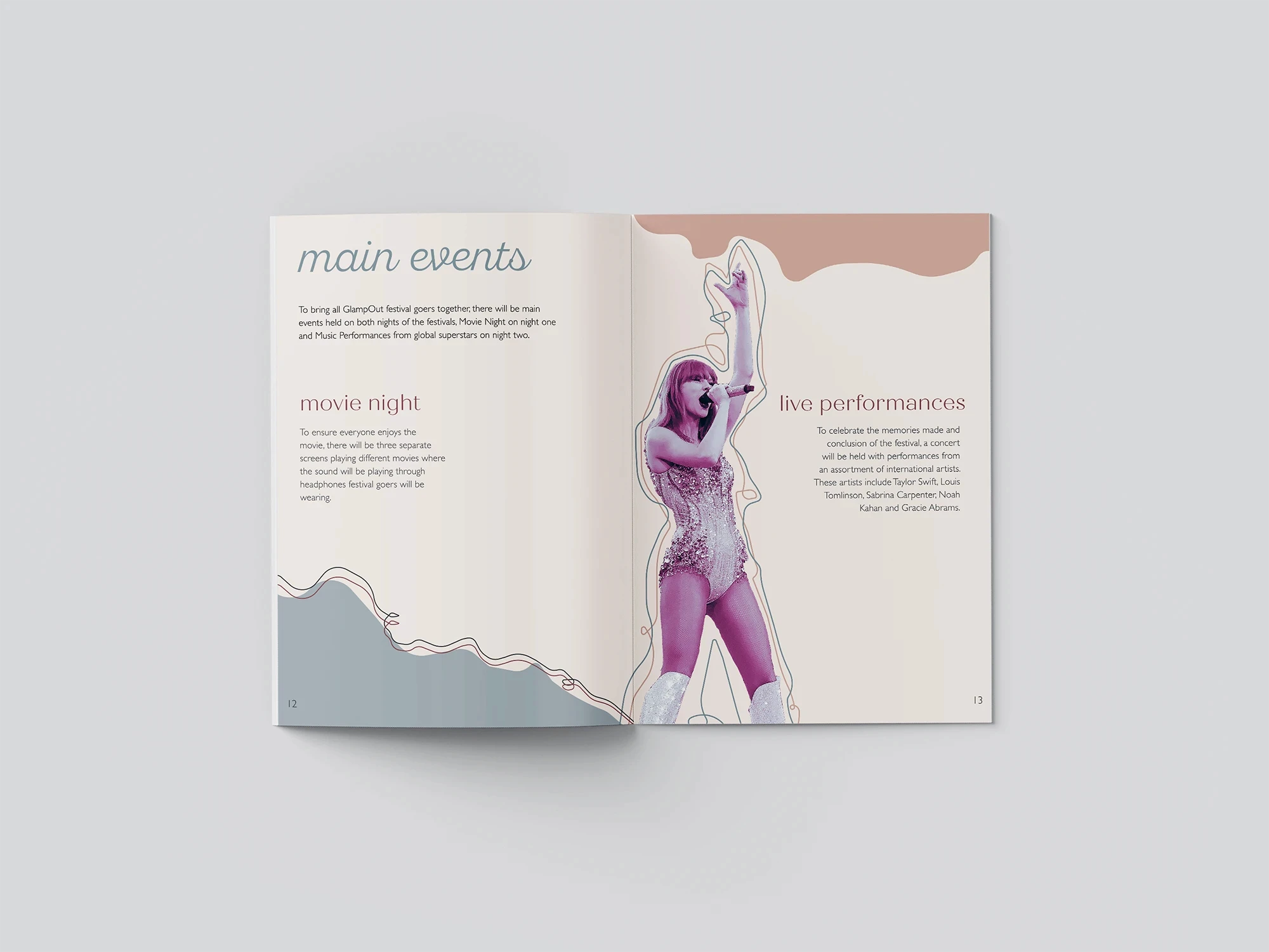
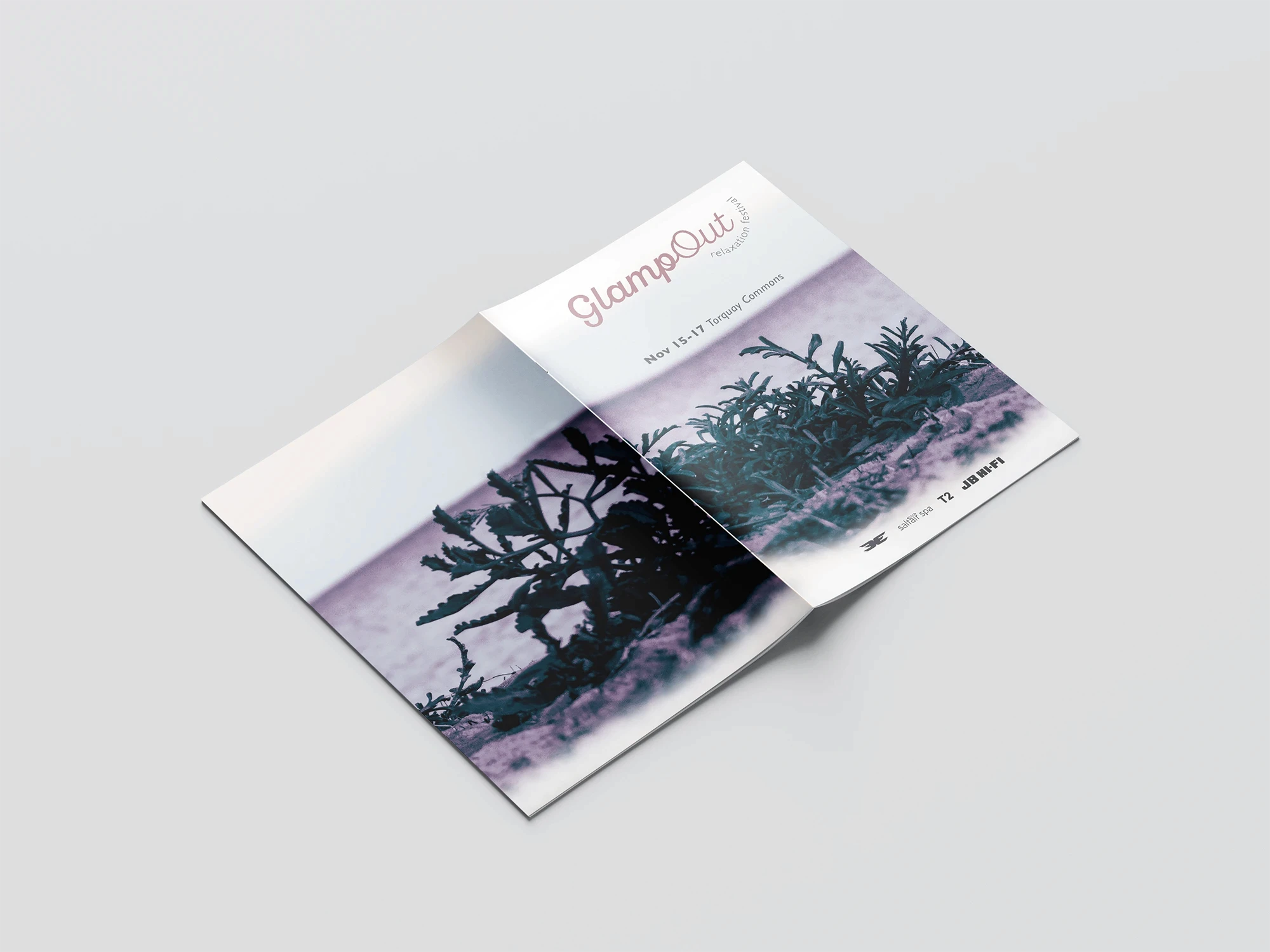
GLAMP OUT
GlampOut is a conceptual festival branding project centred around relaxation, wellbeing, and connection. Inspired by the atmosphere of a coastal summer getaway, I developed a cohesive visual identity across a festival poster, event guide, and wayfinding map. Through considered typography, a soft muted colour palette, and curated photography, the project balances functionality with a calm, inviting aesthetic to create an engaging festival experience.
Year
2024
Scope
Publication and
Identity Design
Style
Serene
Minimalist
Organic
Tools Used
Adobe InDesign
Adobe Illustrator
Adobe Photoshop

THE BRAND SYSTEM.
The GlampOut brand system combines muted coastal tones with contrasting serif and sans-serif typography to create a calm, cohesive visual identity. Inspired by the atmosphere of a relaxed summer getaway, the design balances elegance, warmth, and approachability across every touchpoint.
THE COLOUR PALETTE.
THE TYPOGRAPHY.
The GlampOut brand system combines muted coastal tones with contrasting serif and sans-serif typography to create a calm, cohesive visual identity. Inspired by the atmosphere of a relaxed summer getaway, the design balances elegance, warmth, and approachability across
every touchpoint.
THE COLOUR PALETTE.
THE TYPOGRAPHY.
The GlampOut brand system combines muted coastal tones with contrasting serif and sans-serif typography to create a calm, cohesive visual identity. Inspired
by the atmosphere of a relaxed summer getaway, the design balances elegance, warmth, and approachability across
every touchpoint.
THE COLOUR PALETTE.
THE TYPOGRAPHY.


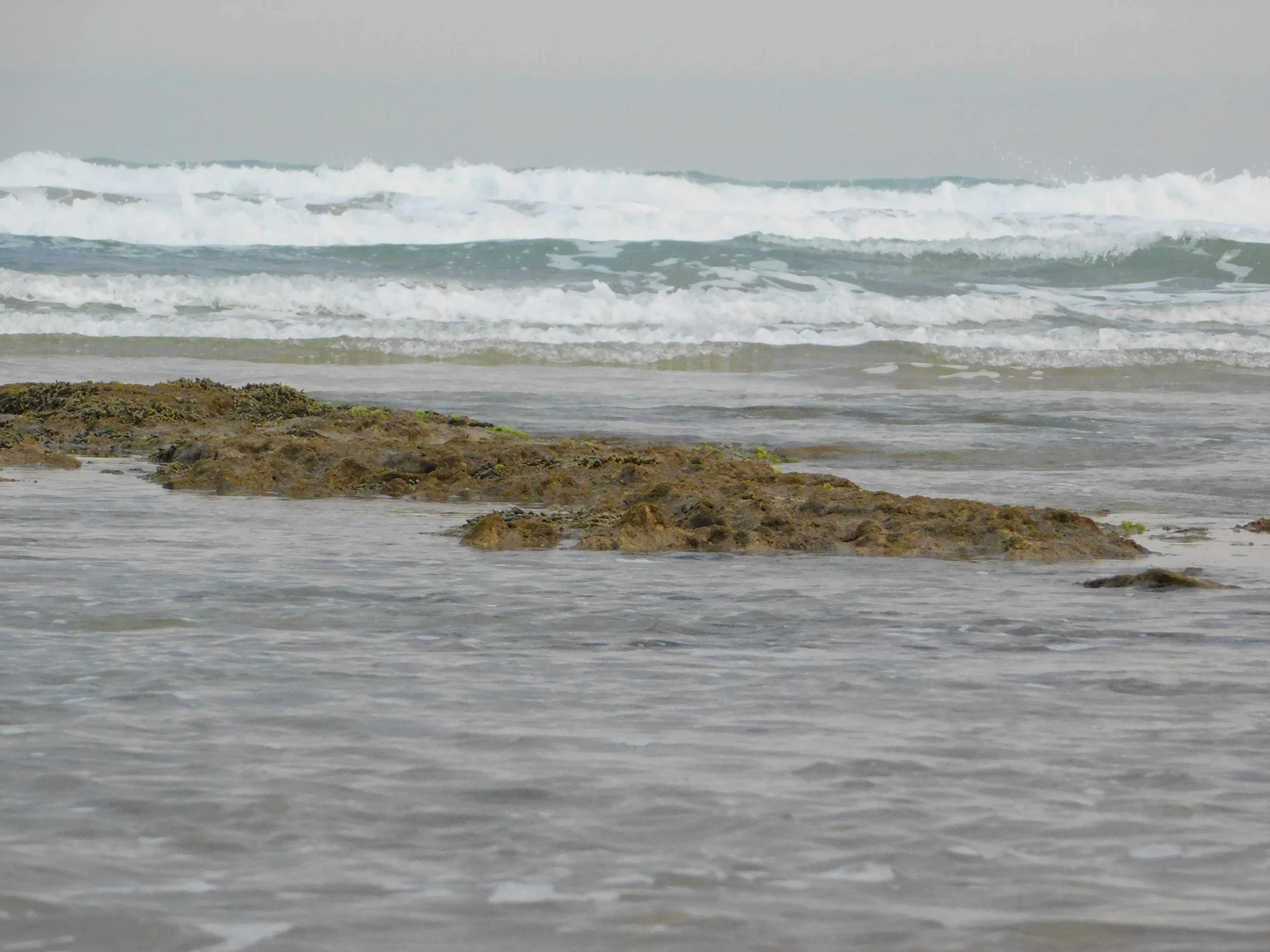
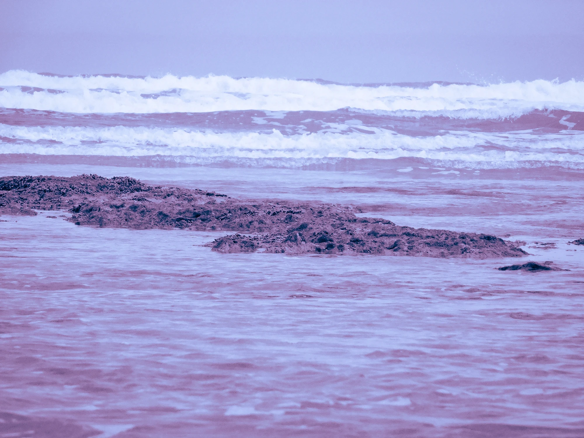
THE PHOTO EDITING PROCESS.
Before.

After.

To create a cohesive visual language across the project, all photography was colour graded using a consistent editing style in Lightroom. Adjustments to lighting, colour balance, and contrast were combined with soft pink and blue tones inspired by the brand palette, resulting in imagery that feels calm, serene, and reflective of the GlampOut experience.
Have a project in mind
or just want to say hi?
I'd love to hear from you!
madimaxwell.creative@gmail.com

GLAMP OUT
GlampOut is a conceptual festival branding project centred around relaxation, wellbeing, and connection. Inspired by the atmosphere of a coastal summer getaway, I developed a cohesive visual identity across a festival poster, event guide, and wayfinding map. Through considered typography, a soft muted colour palette, and curated photography, the project balances functionality with a calm, inviting aesthetic to create an engaging festival experience.
GlampOut is a conceptual festival branding project centred around relaxation, wellbeing, and connection. Inspired by the atmosphere of a coastal summer getaway, I developed a cohesive visual identity across a festival poster, event guide, and wayfinding map. Through considered typography, a soft muted colour palette, and curated photography, the project balances functionality with a calm, inviting aesthetic to create an engaging festival experience.
Year
2024
Scope
Publication and
Identity Design
Style
Serene
Minimalist
Organic
Tools Used
Adobe InDesign
Adobe Illustrator
Adobe Photoshop
THE PHOTO EDITING PROCESS.
Before.
After.
To create a cohesive visual language across the project, all photography was colour graded using a consistent editing style in Lightroom. Adjustments to lighting, colour balance, and contrast were combined with soft pink and blue tones inspired by the brand palette, resulting in imagery that feels calm, serene, and reflective of the GlampOut experience.
THE BRAND SYSTEM.
THE BRAND SYSTEM.
THE BRAND SYSTEM.
Have a project in mind
or just want to say hi?
I'd love to hear from you!
madimaxwell.creative@gmail.com
GLAMP OUT
GlampOut is a conceptual festival branding project centred around relaxation, wellbeing, and connection. Inspired by the atmosphere of a coastal summer getaway, I developed a cohesive visual identity across a festival poster, event guide, and wayfinding map. Through considered typography, a soft muted colour palette, and curated photography, the project balances functionality with a calm, inviting aesthetic to create an engaging festival experience.
Year
2024
Scope
Publication and
Identity Design
Style
Serene
Minimalist
Organic
Tools Used
Adobe InDesign
Adobe Illustrator
Adobe Photoshop
THE PHOTO EDITING PROCESS
Before.
After.
To create a cohesive visual language across the project, all photography was colour graded using a consistent editing style in Lightroom. Adjustments to lighting, colour balance, and contrast were combined with soft pink and blue tones inspired by the brand palette, resulting in imagery that feels calm, serene, and reflective of the GlampOut experience.
Have a project in mind
or just want to say hi?
I'd love to hear from you!
madimaxwell.creative@gmail.com