SHADOWS TO SUNSHINE
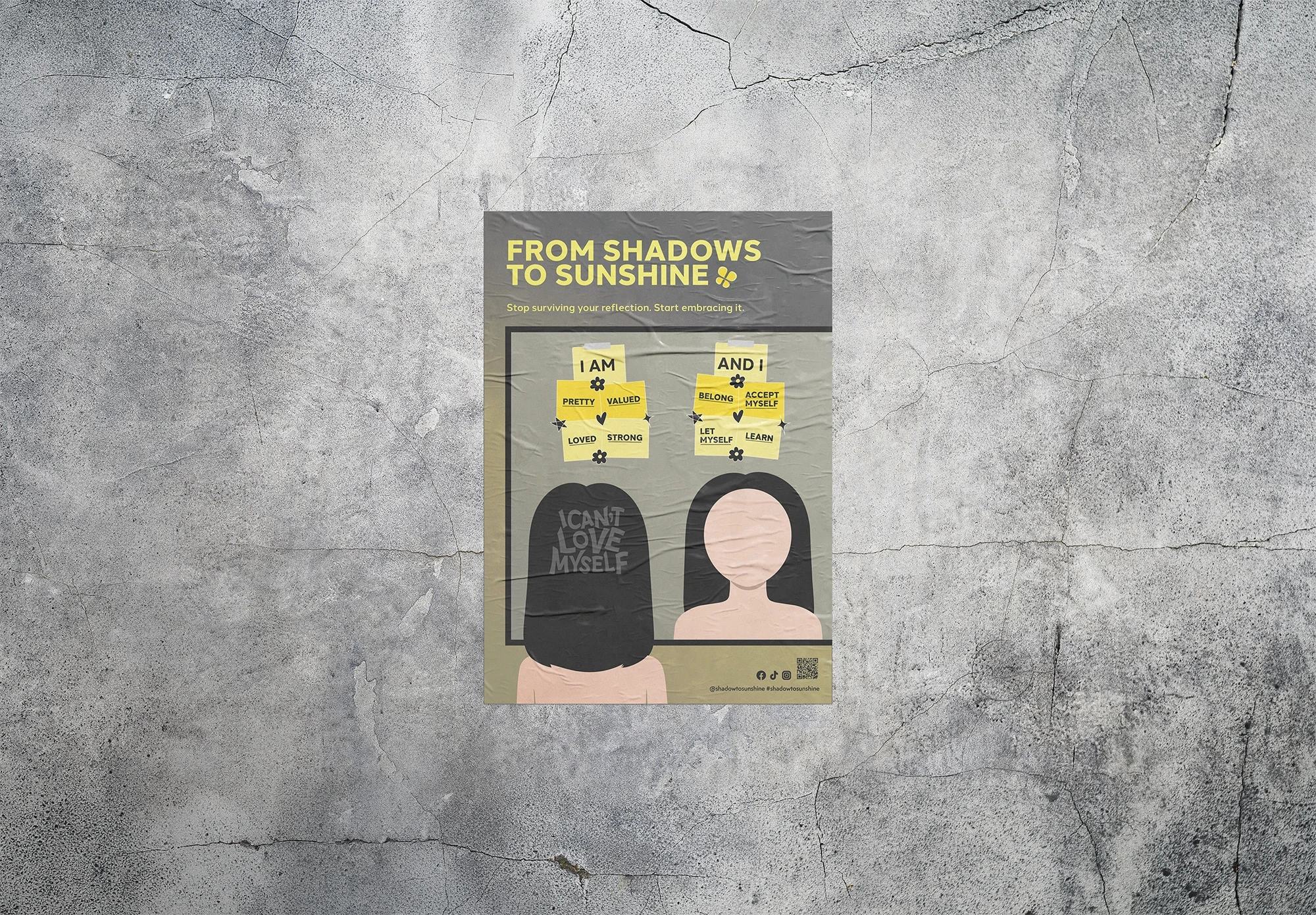
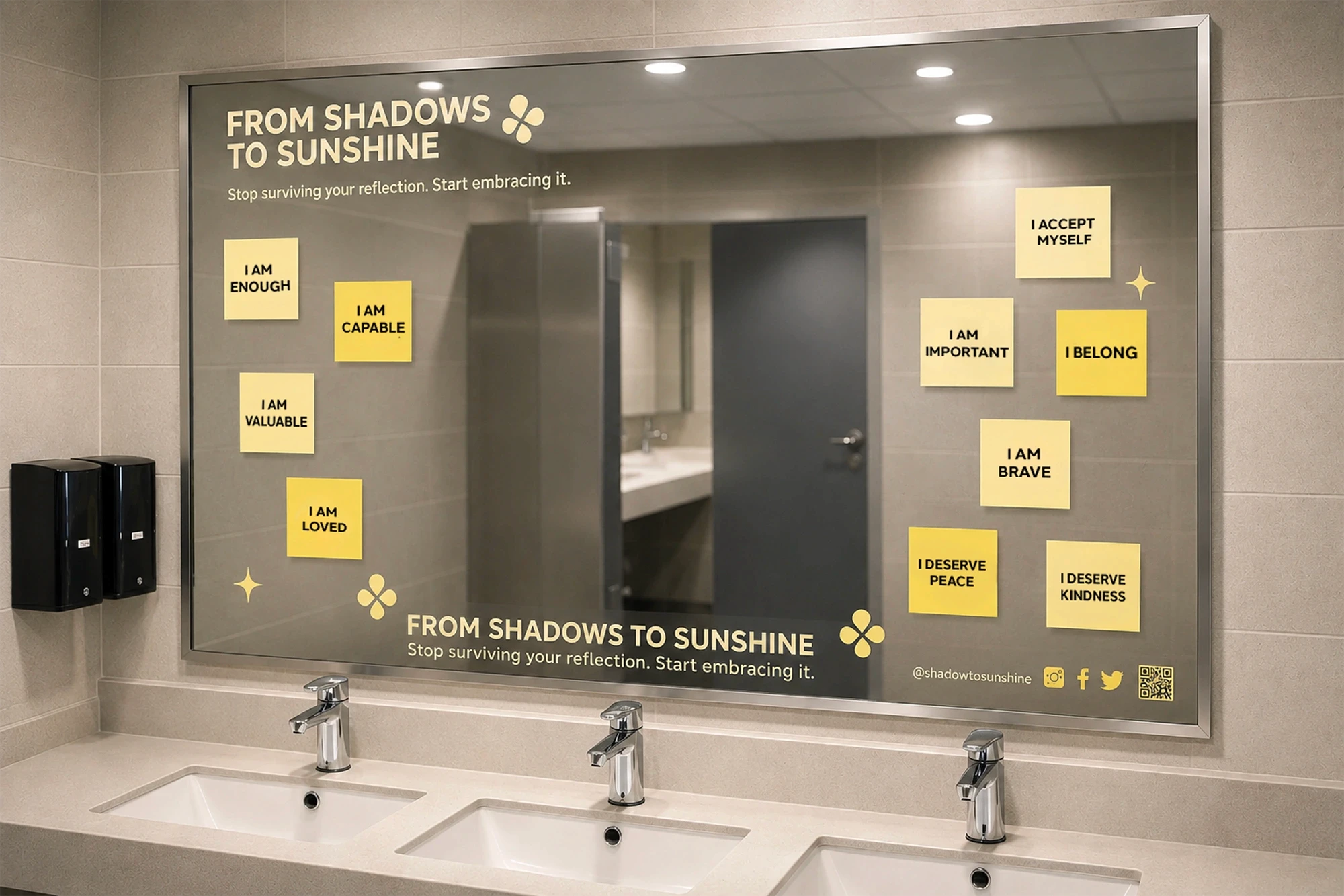
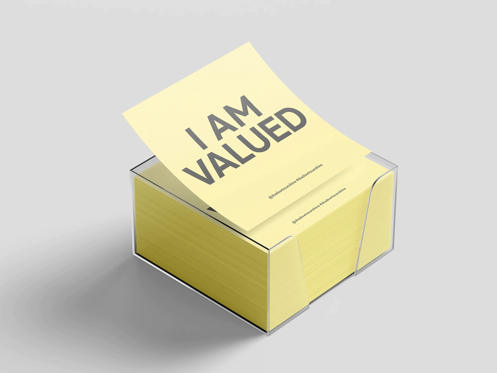
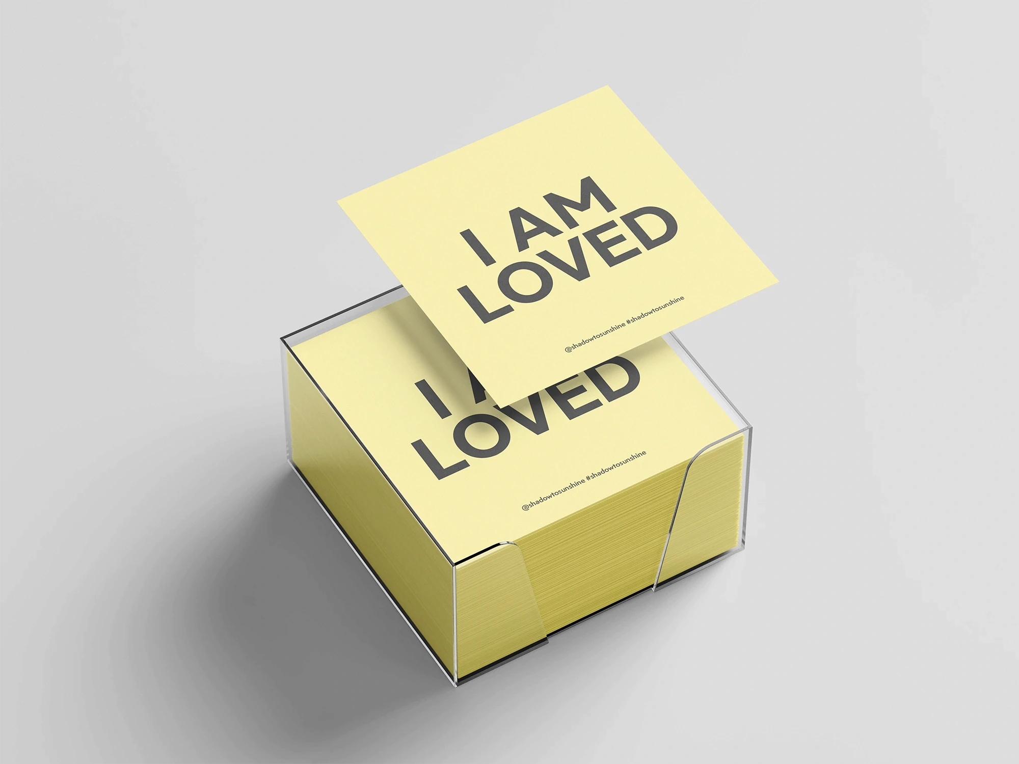
Shadows to Sunshine is a social awareness campaign exploring the impact of body image and self-perception on young Australians. Informed by research and real-world statistics, the project uses positive affirmations, interactive experiences, and community engagement to encourage individuals to challenge negative self-perceptions and embrace self-acceptance. The final outcome combines campaign design and community participation to communicate themes of confidence, wellbeing, and personal growth.
Year
2026
Scope
Campaign Design
Style
Inspiring
Positive
Illustrative
Tools Used
Adobe Illustrator
Adobe Photoshop
Adobe InDesign


THE BRAND SYSTEM.
The Shadows to Sunshine brand system combines a warm, optimistic colour palette with illustrative graphics and approachable typography to create an uplifting visual identity. Inspired by the journey from self-criticism to self-acceptance, the grey tones represent shadowing thoughts, while the yellow palette symbolises sunshine, confidence, and personal growth. The result is a cohesive visual language that communicates positivity and encouragement across every campaign touchpoint.
THE COLOUR PALETTE.
THE TYPOGRAPHY.


Have a project in mind
or just want to say hi?
I'd love to hear from you!
madimaxwell.creative@gmail.com

SHADOWS TO SUNSHINE
Shadows to Sunshine is a social awareness campaign exploring the impact of body image and self-perception on young Australians. Informed by research and real-world statistics, the project uses positive affirmations, interactive experiences, and community engagement to encourage individuals to challenge negative self-perceptions and embrace self-acceptance. The final outcome combines campaign design and community participation to communicate themes of confidence, wellbeing, and personal growth.
Shadows to Sunshine is a social awareness campaign exploring the impact of body image and self-perception on young Australians. Informed by research and real-world statistics, the project uses positive affirmations, interactive experiences, and community engagement to encourage individuals to challenge negative self-perceptions and embrace self-acceptance. The final outcome combines campaign design and community participation to communicate themes of confidence, wellbeing, and personal growth.
Year
2026
Scope
Campaign Design
Campaign
Design
Style
Empowering
Positive
Illustrative
Inspiring
Positive
Illustrative
Tools Used
Adobe Illustrator
Adobe Photoshop
Adobe InDesign
Have a project in mind
or just want to say hi?
I'd love to hear from you!
madimaxwell.creative@gmail.com
THE BRAND SYSTEM.
The Shadows to Sunshine brand system combines a warm, optimistic colour palette with illustrative graphics and approachable typography to create an uplifting visual identity. Inspired by the journey from self-criticism to self-acceptance, the grey tones represent shadowing thoughts, while the yellow palette symbolises sunshine, confidence, and personal growth. The result is a cohesive visual language that communicates positivity and encouragement across every campaign touchpoint.
THE COLOUR PALETTE.
THE TYPOGRAPHY.
SHADOWS TO SUNSHINE
Shadows to Sunshine is a social awareness campaign exploring the impact of body image and self-perception on young Australians. Informed by research and real-world statistics, the project uses positive affirmations, interactive experiences, and community engagement to encourage individuals to challenge negative self-perceptions and embrace self-acceptance. The final outcome combines campaign design and community participation to communicate themes of confidence, wellbeing, and personal growth.
Year
2026
Scope
Campaign
Design
Style
Inspiring
Positive
Illustrative
Tools Used
Adobe Illustrator
Adobe Photoshop
Adobe InDesign
THE BRAND SYSTEM.
The Avalon Raceway brand system draws inspiration from the shape and movement of a race track, translating these qualities into a modern monogram logo and dynamic visual identity. A high-contrast colour palette enhances visibility and impact, reflecting the atmosphere and intensity of race events. Together, these elements create a distinctive and cohesive brand experience that balances contemporary appeal with the raceway’s long-standing heritage.
THE COLOUR PALETTE.
THE TYPOGRAPHY.

Have a project in mind
or just want to say hi?
I'd love to hear from you!
madimaxwell.creative@gmail.com